DISPLAY
—
WINDOWS / INTERIORS
Window concepts for each season are determined by corporate and planned months in advance. I order all of the props, paints, and tools needed for the installation. The Visual Merchandising team and I collaborate to create strong fashion pulls that fit the display's concept. I provide feedback to the Visual Merchandisers on my team to select the best fashion for our windows from the start of the project up until it's time to strike the mannequins. Each member of the team brings a specific skillset where they're strongest, but we all come together to collaborate on display composition, lighting, and prop building.
QUARTER Four
November, December, January 2017–18
WINTER 2018
HOLIDAY
We chose to celebrate the Nordic heritage of the company by embracing the modernity, simplicity and appreciation for nature that serve as
hallmarks of Scandinavian design. The campaign came to life via playful interpretations of classic Nordic lines, themes and holiday icons, while the use of time-honored holiday colors and organic materials. The goal was to strike the balance between Nordic nostalgia and newness.
QUARTER THREE
July, August, September 2017
FALL ONE
Fall is about warm colors and unusual layering. Socks under open toed shoes allows you to take some of your summer pieces into early fall. The windows and common area presentations plays with the idea of removing
the function from everyday objects.
FALL TWO
QUARTER TWO
MAY, JUNE, JULY 2017
SUMMER ONE
This design was intended to evoke the essence of floral
in bloom.
SUMMER TWO
Here, happiness lies somewhere between a riff on fluffy Mui Mui slides.... and the first sweet taste of summer. We were inspired by summer and the palette created by mother nature. “Greenery is nature’s neutral. The more submerged people are in modern life, the greater their innate craving to immerse themselves in the physical beauty and inherent unity of the natural world. A life-affirming shade, Greenery is also emblematic of the pursuit of personal passions and vitality.” inspiration found on Pantone.com
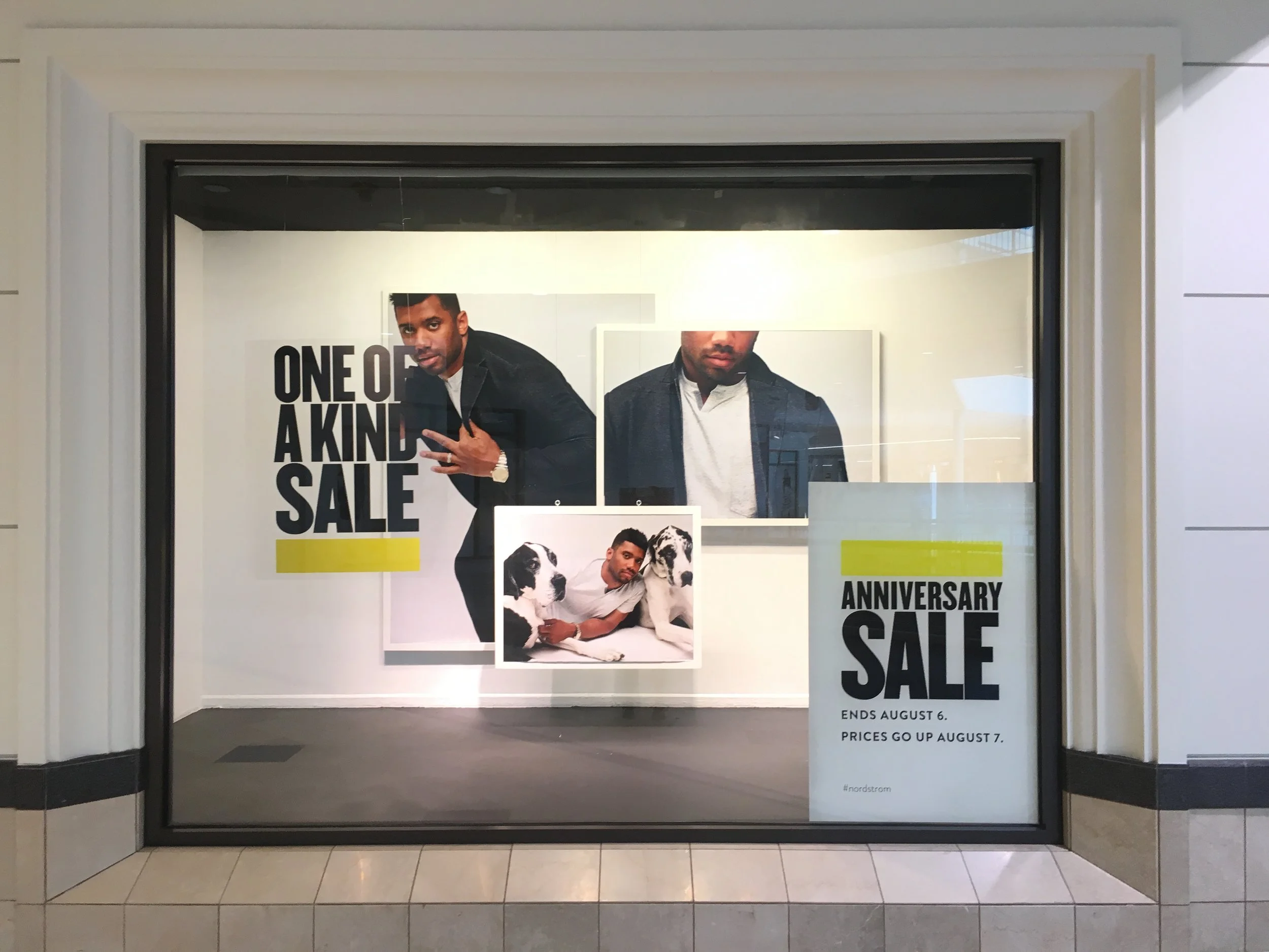
ANNIVERSARY SALE
This is a large scale yearly sale that happens during the summer. These windows and interior presentations are to show the campaign as seen across all channels.
Quarter ONE
FEBRUARY, MARCH, APRIL 2017
SPRING ONE
The ethereal quality of this design concept lends
itself to a natural symmetrical effect. It was intended to build drama, allowing the shadows and elements to play with perspective while building an environment that features the newest fashion.


